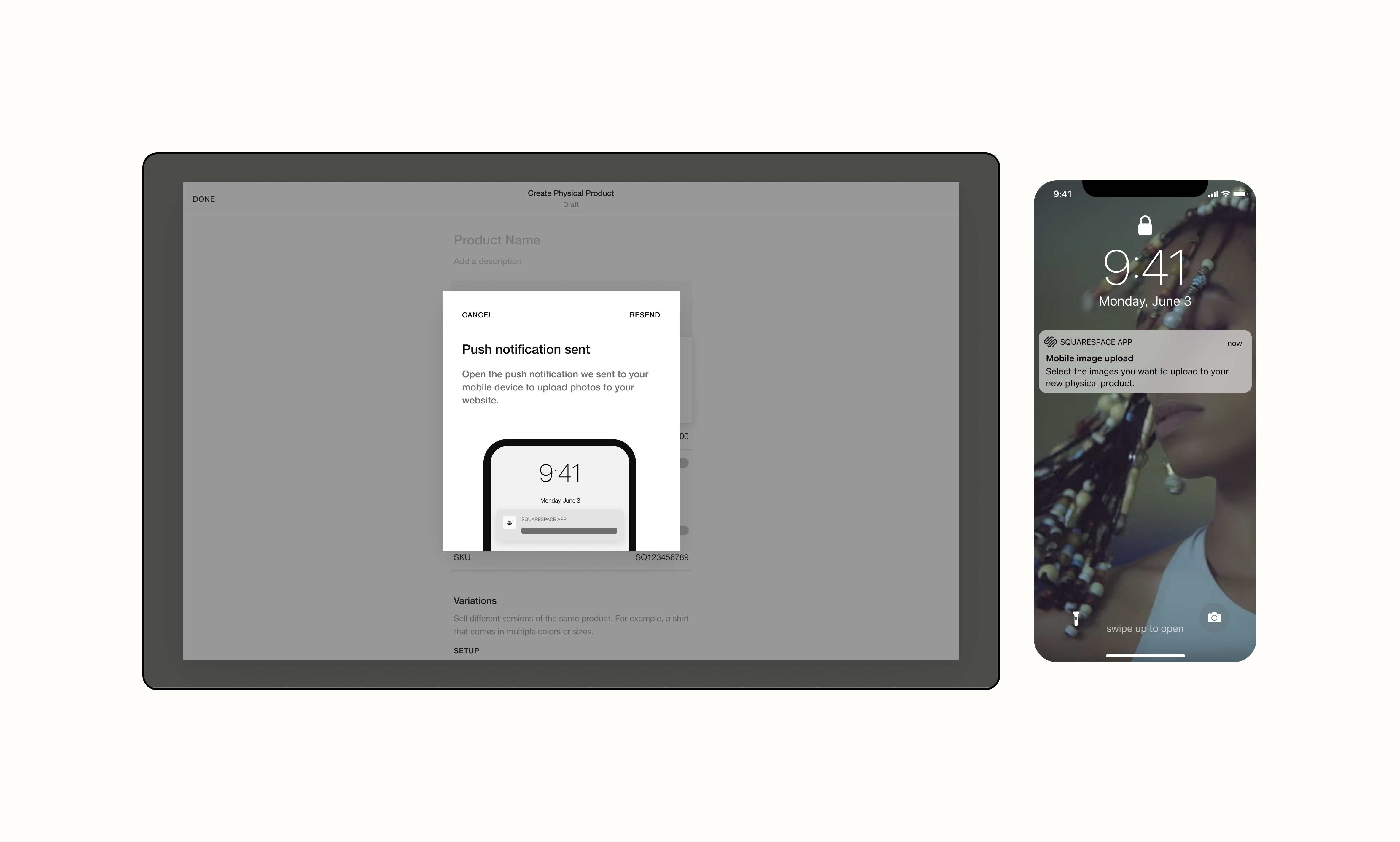
ProblemThe majority of our Squarespace users arrive to our platform with the hopes of creating immersive content-heavy websites for their businesses, side-hustles, or personal brands. Given that it’s 2022, many of these users capture there content on their mobile devices. However, find it lengthy and difficult to transfer these images & video content onto our platform.
Context
Our current experience drops people into our application without showing them how to leverage our unique capabilities and potential value to their businesses. An onboarding experience proved important to not only educate users about important task flows, but leverage our market-cutting capability.
Approach
[01]Conducted competitive analysis of similar multi-device experiences in the tech space to see if there are any patterns that I should be aware of when designing.
[02]Quickly mock up mid-fidelity designs to run some earlier concept testing with users to see if this experience is something that our users want and matches their mental model.
[03]Identify entrypoints and finalize nuanced user flows.
[04]Pitch idea to crossfunctional and cross-product partners to see if there is interest in investing in this product feature, since this feature could be utilize across the CMS.
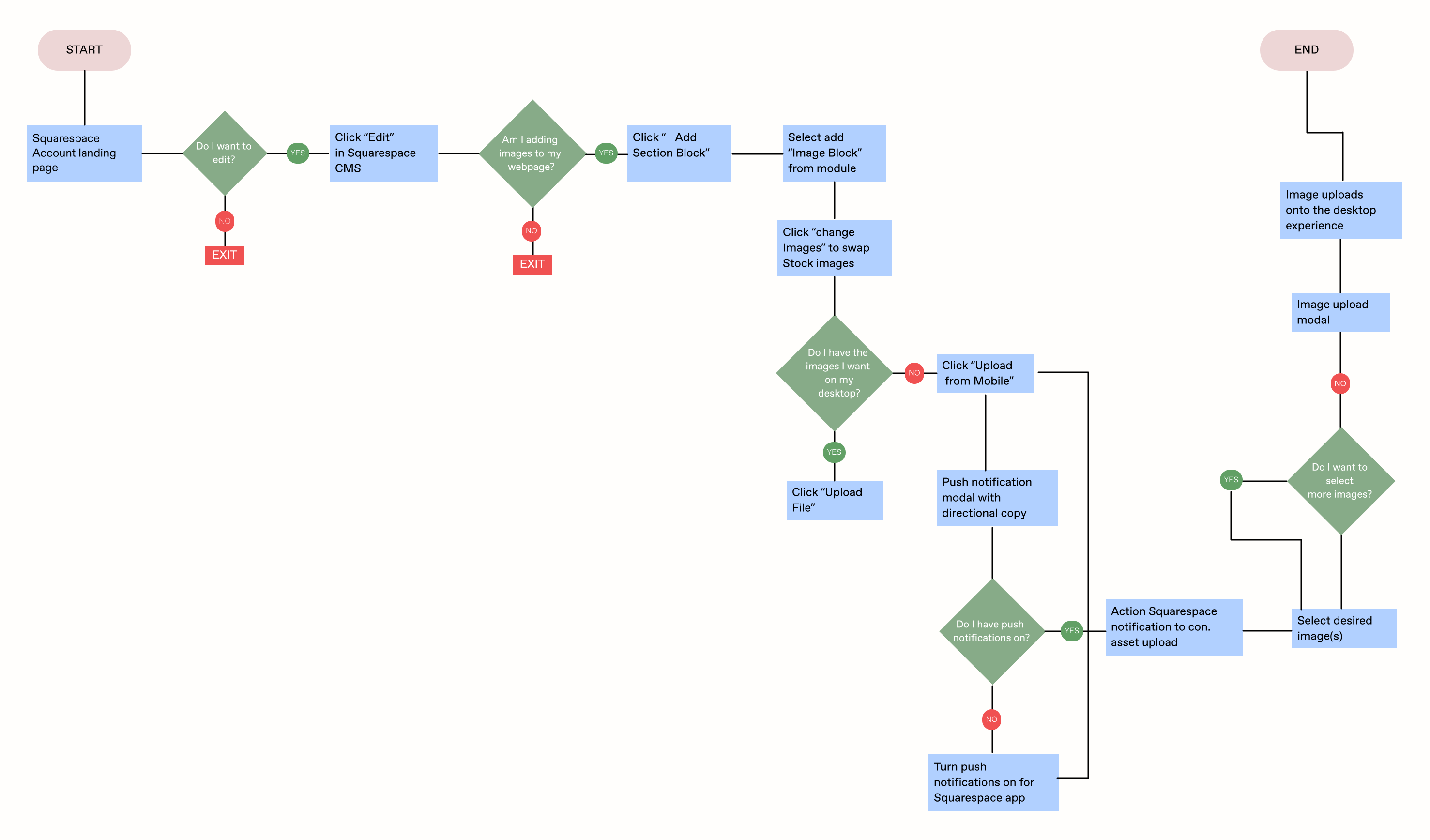
Flushing out nuanced userflows allowed me to perfectly design screens for each specific workflow when finally moving into higher fidelity mock ups.
Action
The multiple userflows (respective of multiple entrypoints to the feature) helped ground this multi-device asset upload experience moving into higher fidelity designing (see designs below). During this design process, I made sure to loop in a few engineers to validate this features feasibility as well as to be aware of its potential complexity. Those conversations helped mold the screens in ways that were digestable for engineering to build within the constrains of our CMS platform.
Before socializing this idea with other cross-product partners who could potentially benefit from this feature, I wanted to get early mocks in front of users. I ran a quick round of unmoderated user testing in order to gauge interest in this feature from our userbase. Many were estatic that a feature like this was being conceptualized & wanted to use it immediately. I, then, led the Mobile Team in organizing these findings just so the entire team could be aware of the explicit needs of our users.
In synthesizing these result behind the scenes, I found that 92% of our participants raved about this new feature, wanting to be able to access it immediately as it exceeded their expectations. 80% of participants felt the experience intuitive and that there were moments in the interactions that just “made sense”. Nevertheless, there were a few users (38%) that wanted more directional copy to guide them through this multi-platform experience. Mainly during states where multiple devices were communicating.
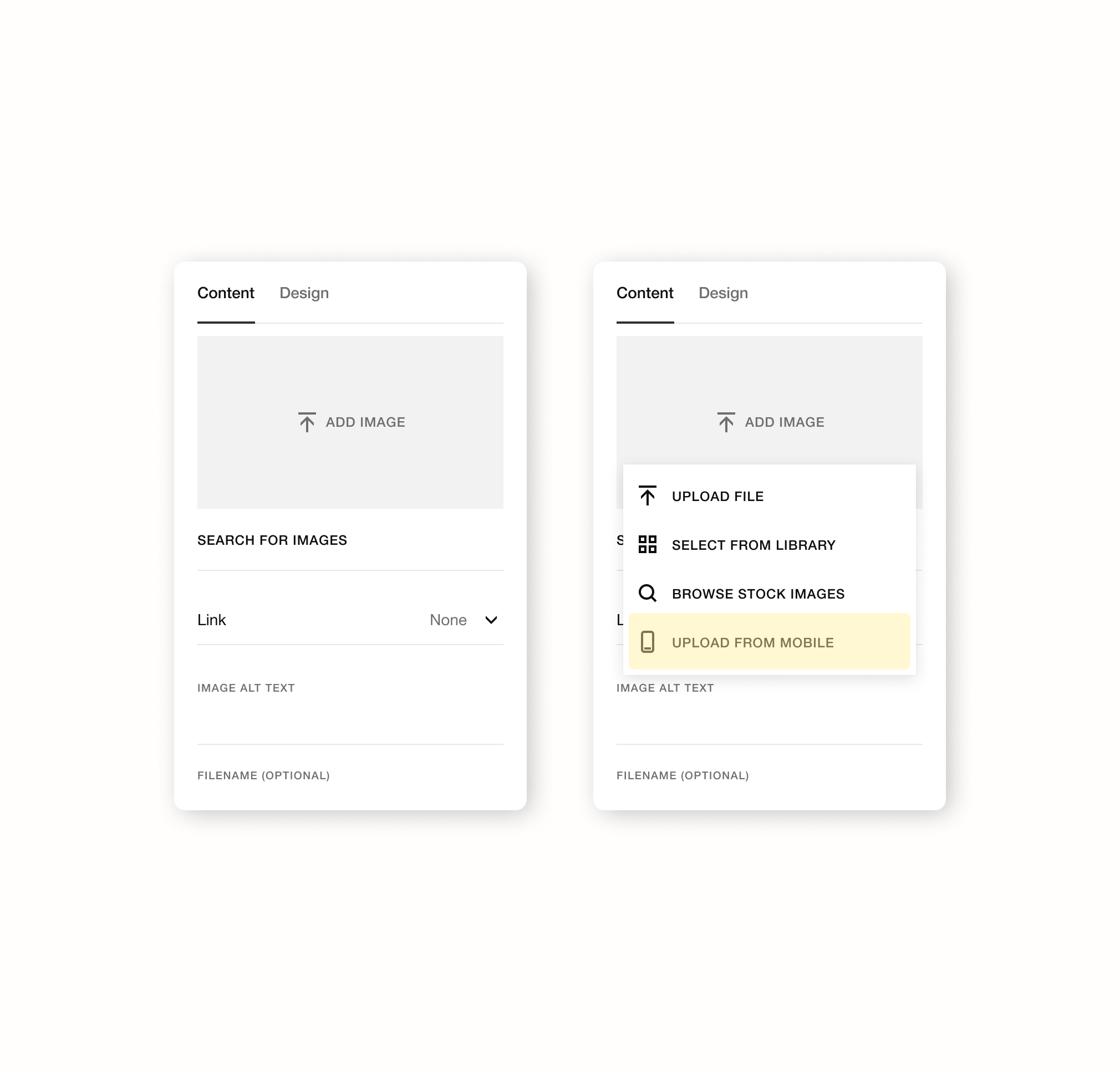
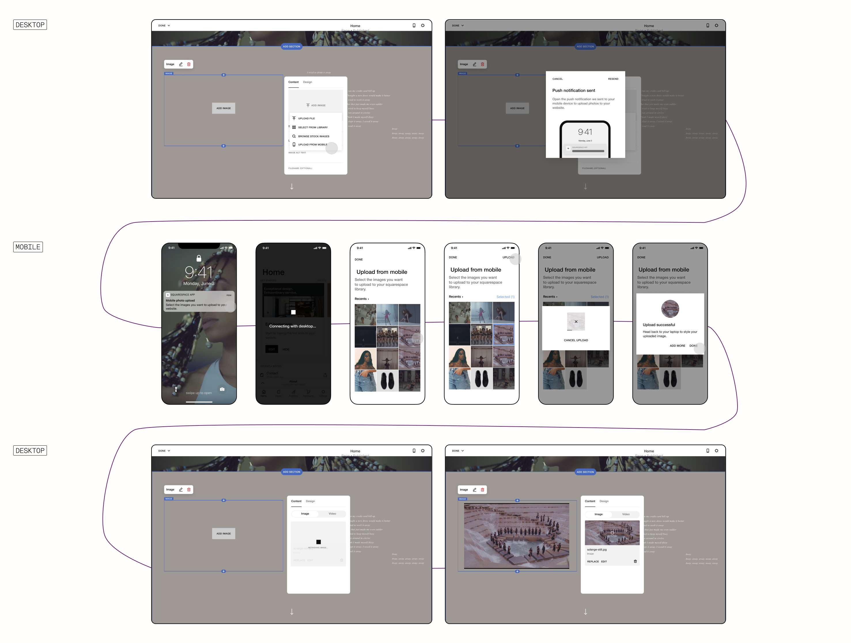
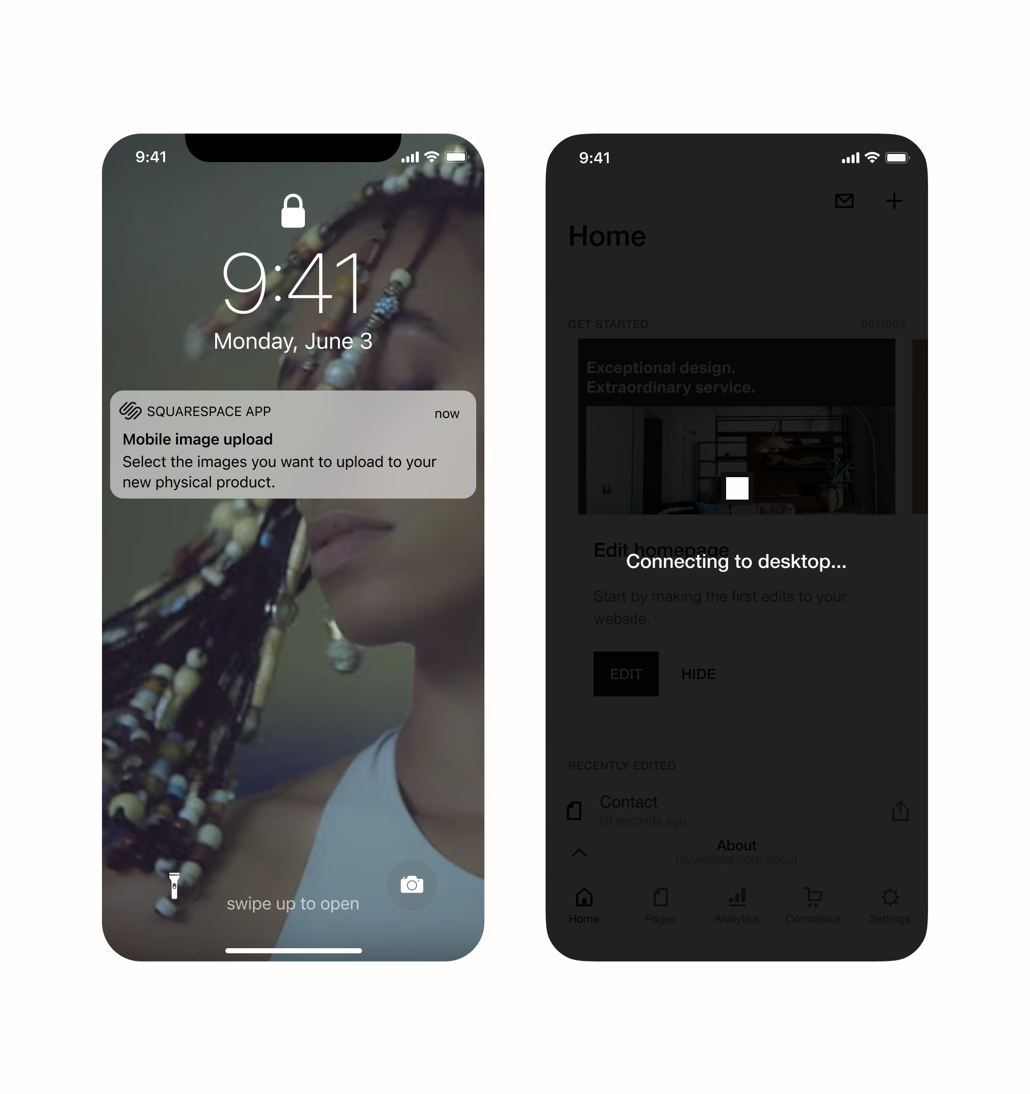
This experience is initiated on the desktop platform, then switches to mobile when the user selects “Upload from mobile”. This prompts a module informing the user to complete the rest of the workflow on their mobile device. On mobile users are symultaniously allowed to select the image(s) of their choice and upload to the desktop experience in real-time (prototype available on request).
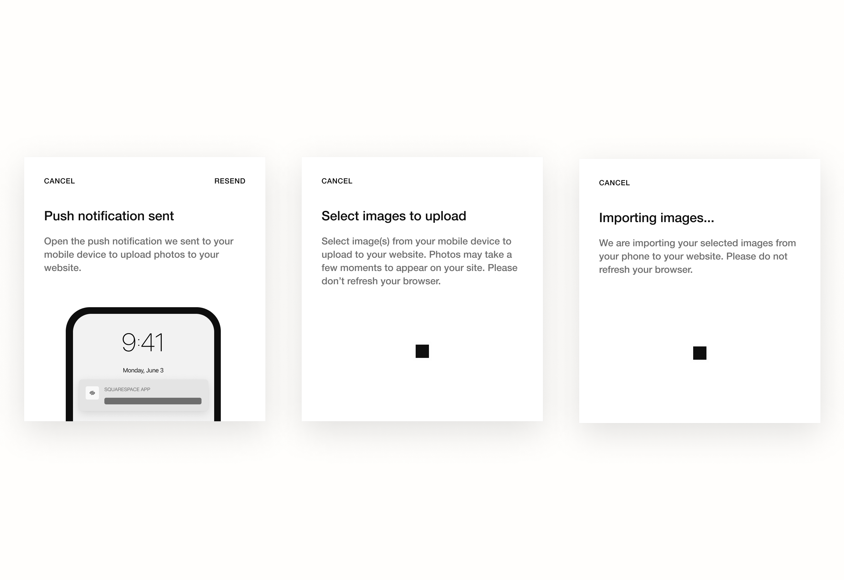
As a result of the feedback given during user testing, I partnered with the cross-functional Content Strategy team to finalize the language around the upload experience that would help orient the user regardless of the device they're looking at. We built out a three part modal experience where users are shown different modal copy contextual to their content uploading stage.
takeaways
With the designs in a good place, UXR partnered to run a fake door testing with the Asset Uploader in order to have a stronger arguement to get other teams involved. In the results, we found that "Upload from mobile" was the second highest engaged option, only behind "select from library".
When rolled out to a number of our BETA users, there was a 69% successful upload experience – so there are still a few techinal wirings to iron out.
[01]Knowing when to bring cross-functional partners into project conversations is truly a skill. Because this was a cross-product experience, I had to be strategic about who/when I allowed folks into the fold.
[02] When in doubt always build your arguement or pitch on the perceptived impact a feature will have, beyond the financial and onto the human-level.