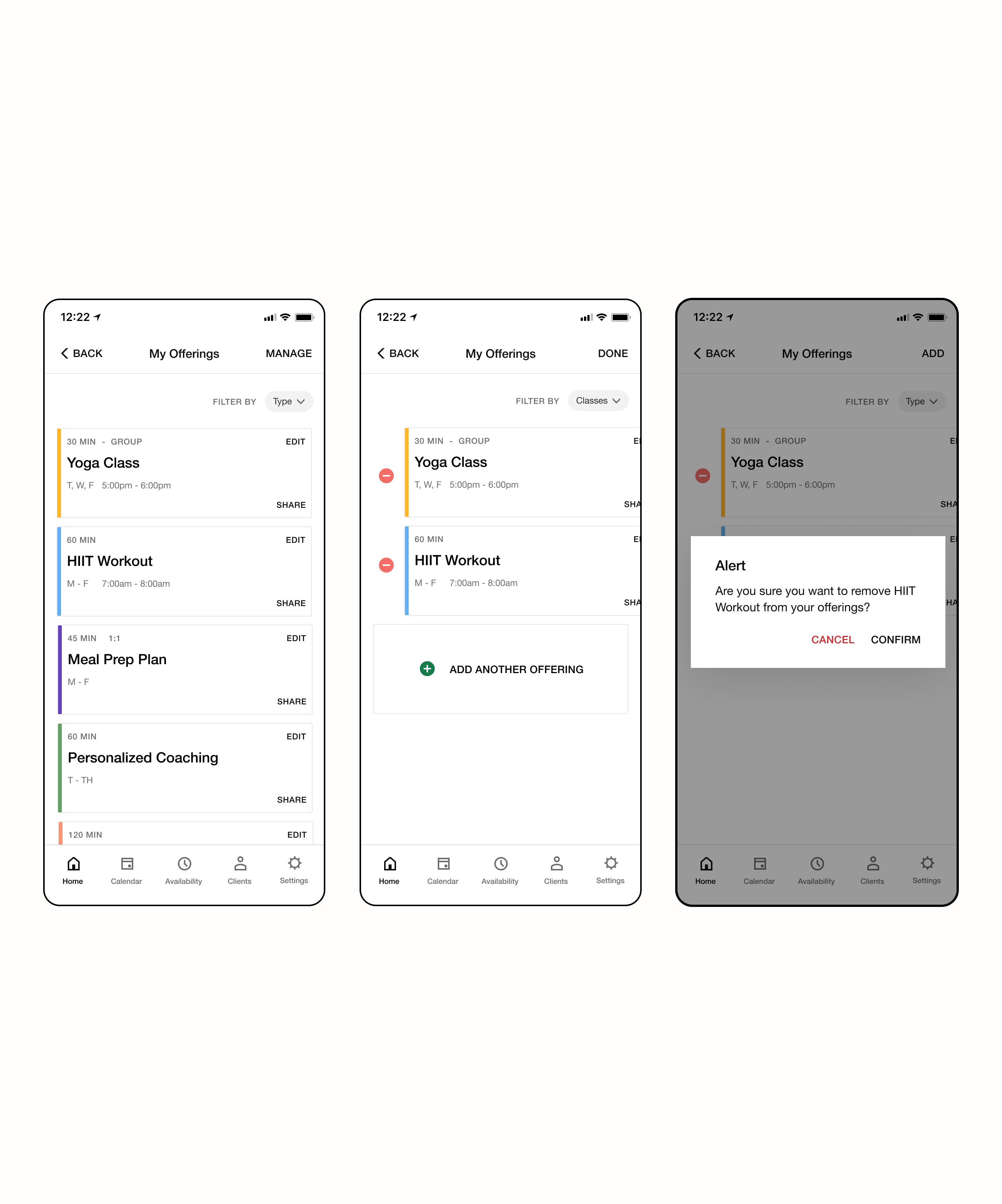
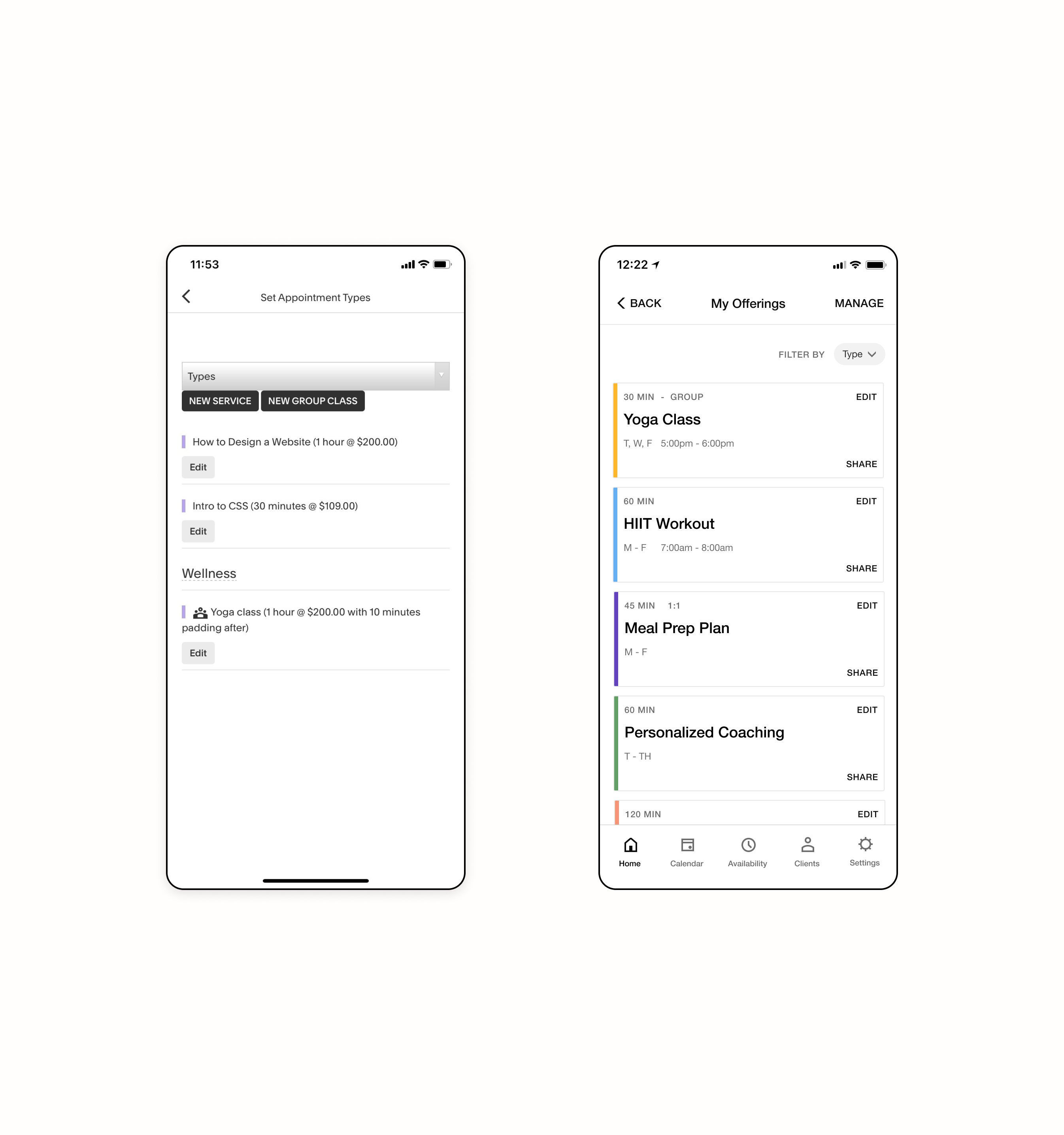
Problem Many of our users noted they manage and create appointment offerings on their mobile devices, however the experience makes it extremely confusing and difficult to manage given the current state. We designed an intuitive experience by making intentional changes to the experience's information architecture and visual heirarchy.
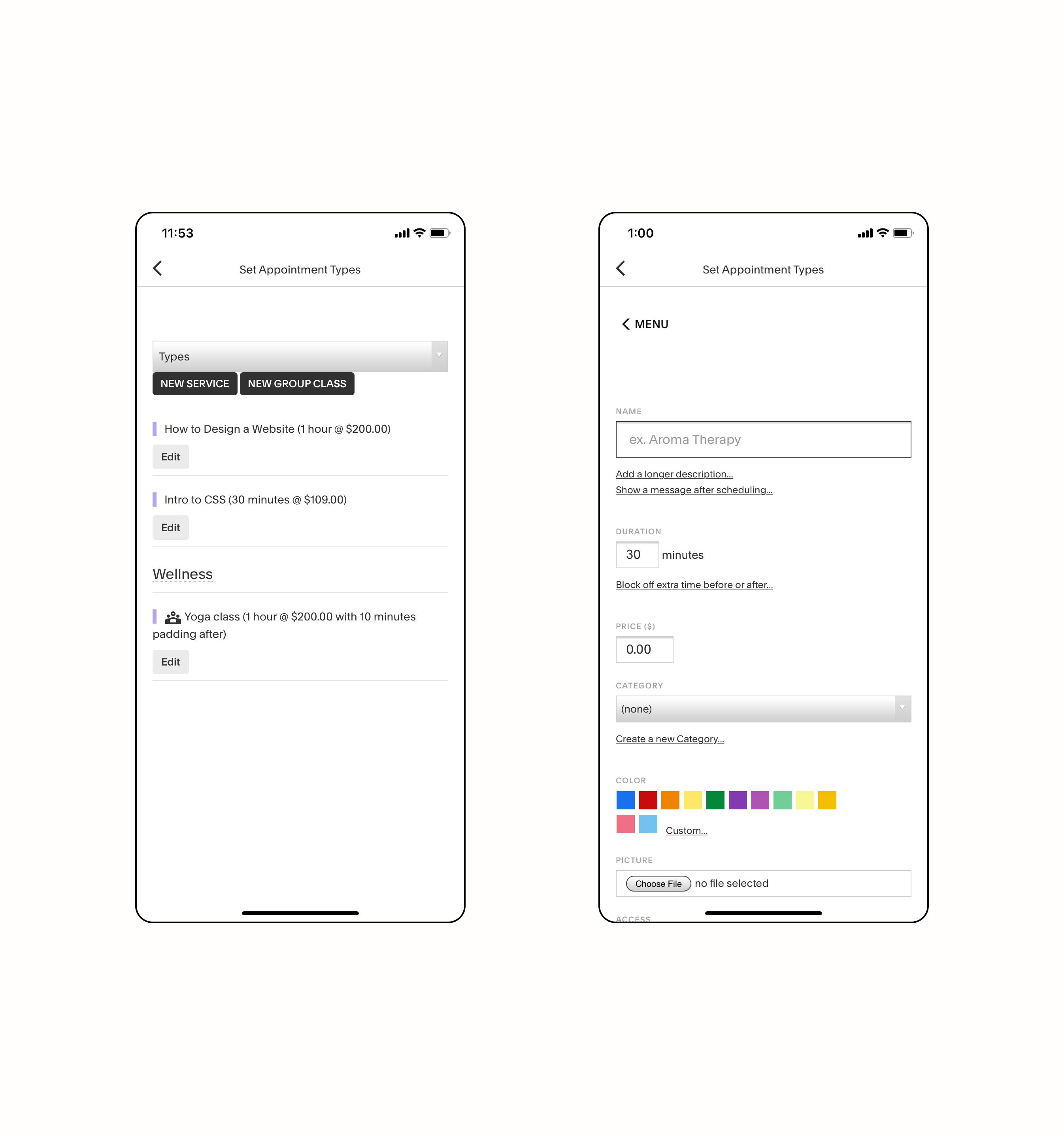
Context
Upon initial user research, UXR found that many users had trouble completing the most important tasks on our application. Many struggled to set their availability, create/manage their appointment offerings, as well as communicate with clients all things essential to ones Scheduling business.
I proposed the quickest lift would be to redesign the appointment management experience as it was the main issue the arose in user interviews and also what seemed to be the lightest technical lift for our one person mobile engineering team.
Approach
[01]I ran a card sorting exercise with a few users to better understand their mental models when managing their Class & Appointment offerings. This helped surface important infromation earlier within users' workflows.
[02]The team partnered on interviewing our "super" users in order to understand what actions our users were making with their appointments & classes on mobile.
[03]I conducted a competitor analysis to understand what opposition in the space were desigining and understanding how that effects our potential users mental memory or expectations.
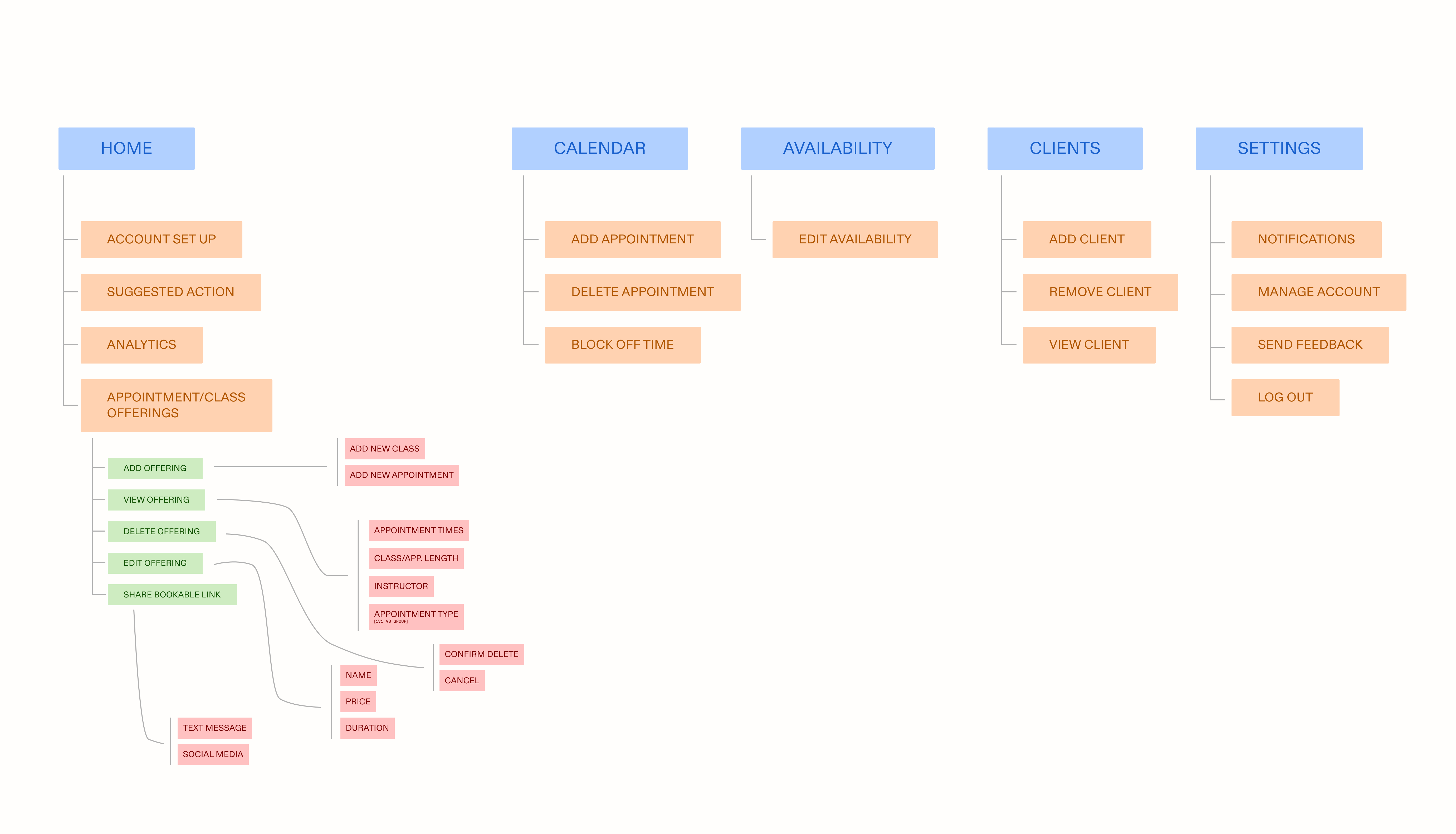
I used this IA Map to construct low and high fidelity mock ups of the new "My Offerings" experience that mirror users' mental models.
Action
I used this mapping to inform these initial design directions, focusing on elevating the visual/information hierarchy, increasing important task completion rates, as well as leveraging mobile functionality through social sharing and other contemporary patterns.
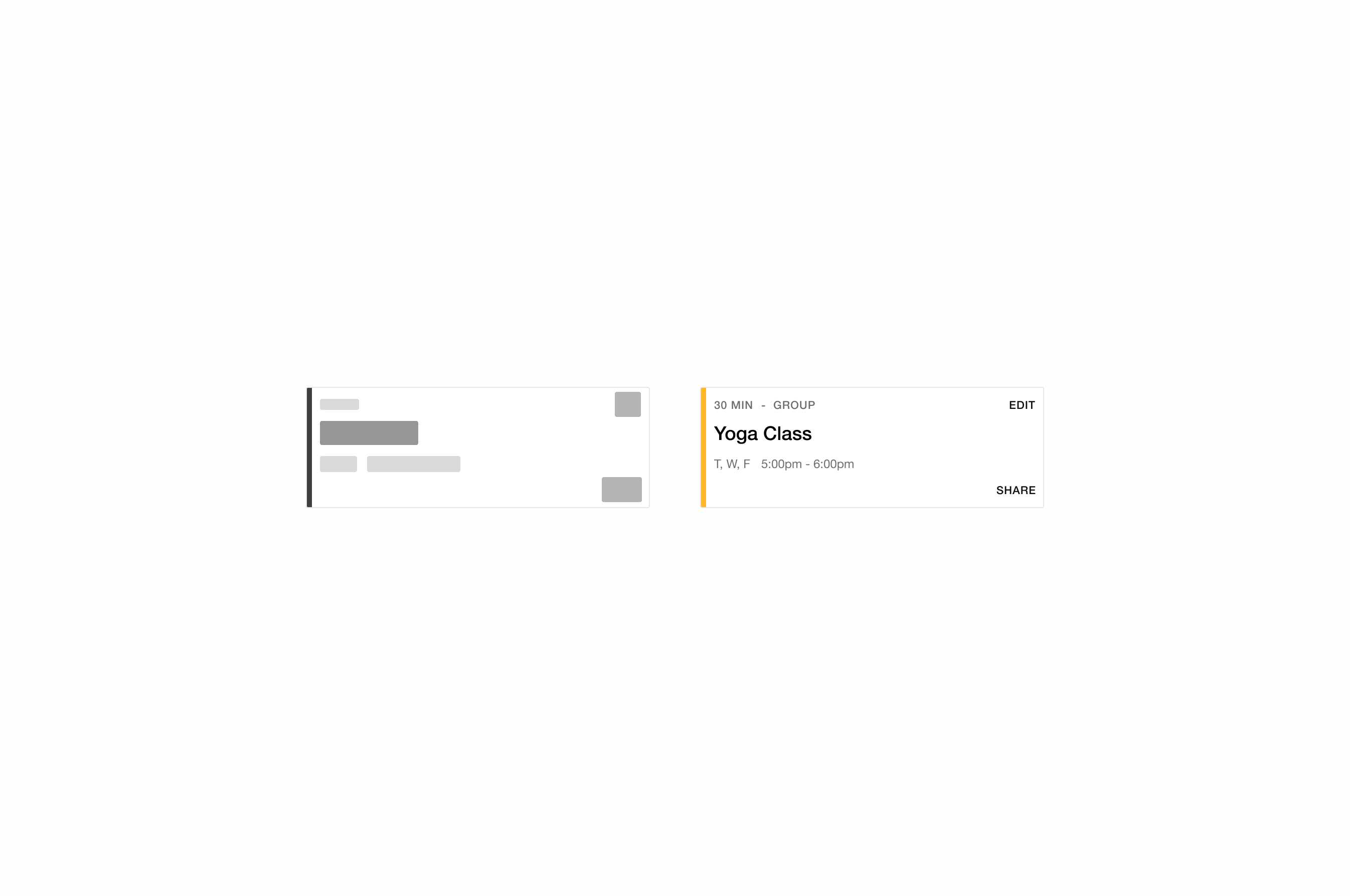
Increasing visual hierarchy through typography changes and color, it became easier for users to implicitly prioritize information on this screen. Surfacing information like day and time services are offered decreased the amount of work users needed to originally do to check their service information. Color-coding appointment offerings allowed people to create implicit associations and efficiently read their color-coded calendar screens.
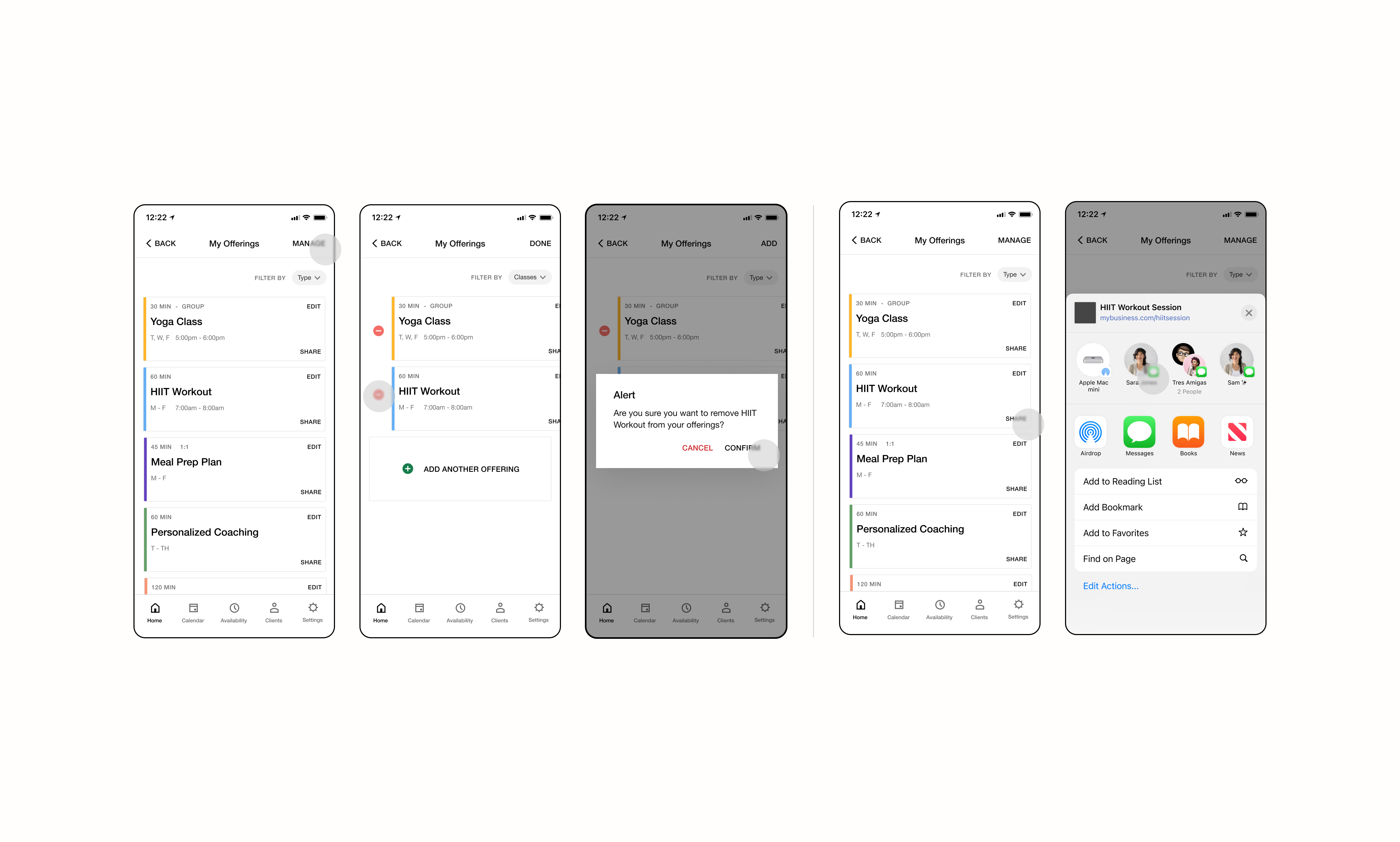
Quick editing functionality allowed people to manage their offerings easily and efficiently. Many cited that the adding/deletion of offerings was explicit in ways the original experience lacked. Users were able to complete these tasks in shorter amounts of time and in fewer taps.
Sharing offerings through bookable links was extremely important for our Scheduling users — allowing them to clientele on the go. We saw a 20% increase in the amount of users who incorporated “link sharing” to attract new clients. Accounts that used sharing external links to their appointment offerings generated $5k more on average than accounts not using said feature.
takeaways
[01]Early exporatory research is key!! If I didn't have my ear to the pulse of our users, I wouldn't have known that mobile was an important sores spot for them. Their perspective made it easier to make an internal arguement for more investment on mobile.
[02] Making changes to a system visual heirarchy can make the most impactful changes in an experience for users as you're designing with their mental models in mind.