ProblemMany of our users aren't seeing the value in our platform within the first 14 days of the Squarespace Scheduling experience, so they are not becoming subscription holders when their trials expire. I designed an in-app onboarding experience that allows users to experience and leverage our functionality.
Context
Many users are downloading our app during the initial stages of their business journey — a time that can be extremely stressful and scary. This gives us a perfect opportunity to put their anxieties to bed and show them we are here to support them during this pivotal time.
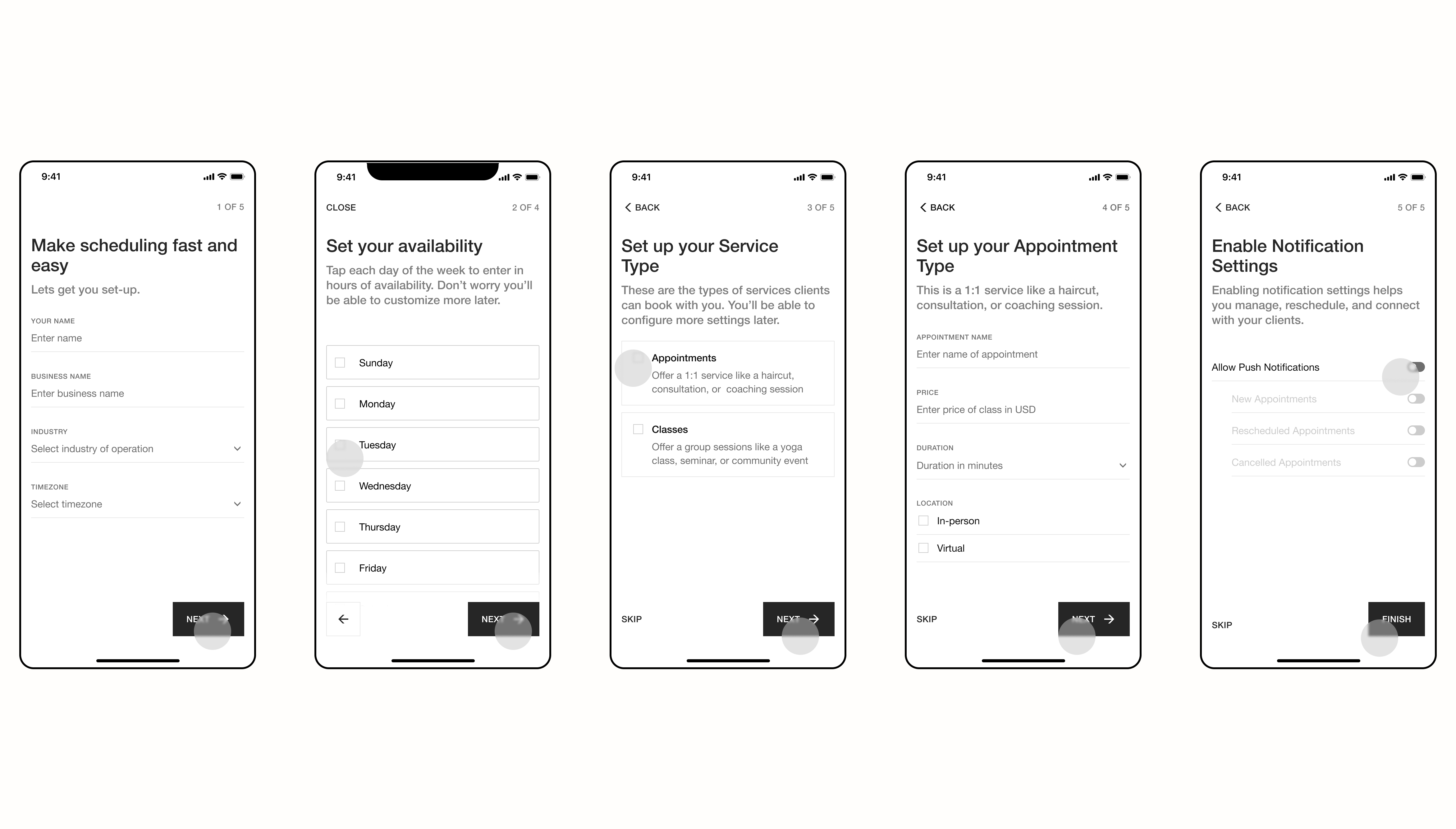
Our current experience drops people into our application without showing them how to leverage our unique capabilities and potential value to their businesses. An onboarding experience proved important to not only educate users about important task flows, but leverage our market-cutting capability.
Approach
[01]Conducted moderated user interviews through UserTesting.com where participants who ran their own scheduling businesses (not necessarily with SQSP Scheduling) to understand their decision-making process as it relates to deciding which scheduling platform to invest in.
[02]Partnered with Product Analytics team to map out "successful" user journey within the 14-day Trial period to better understand what differentiated these users from those that didn't subscribe.
[03]Quickly mocked up low-fidelity wireframes to run some exploratory usability testing to see if the design direction gleaned from earlier insights was actually solving user problems.
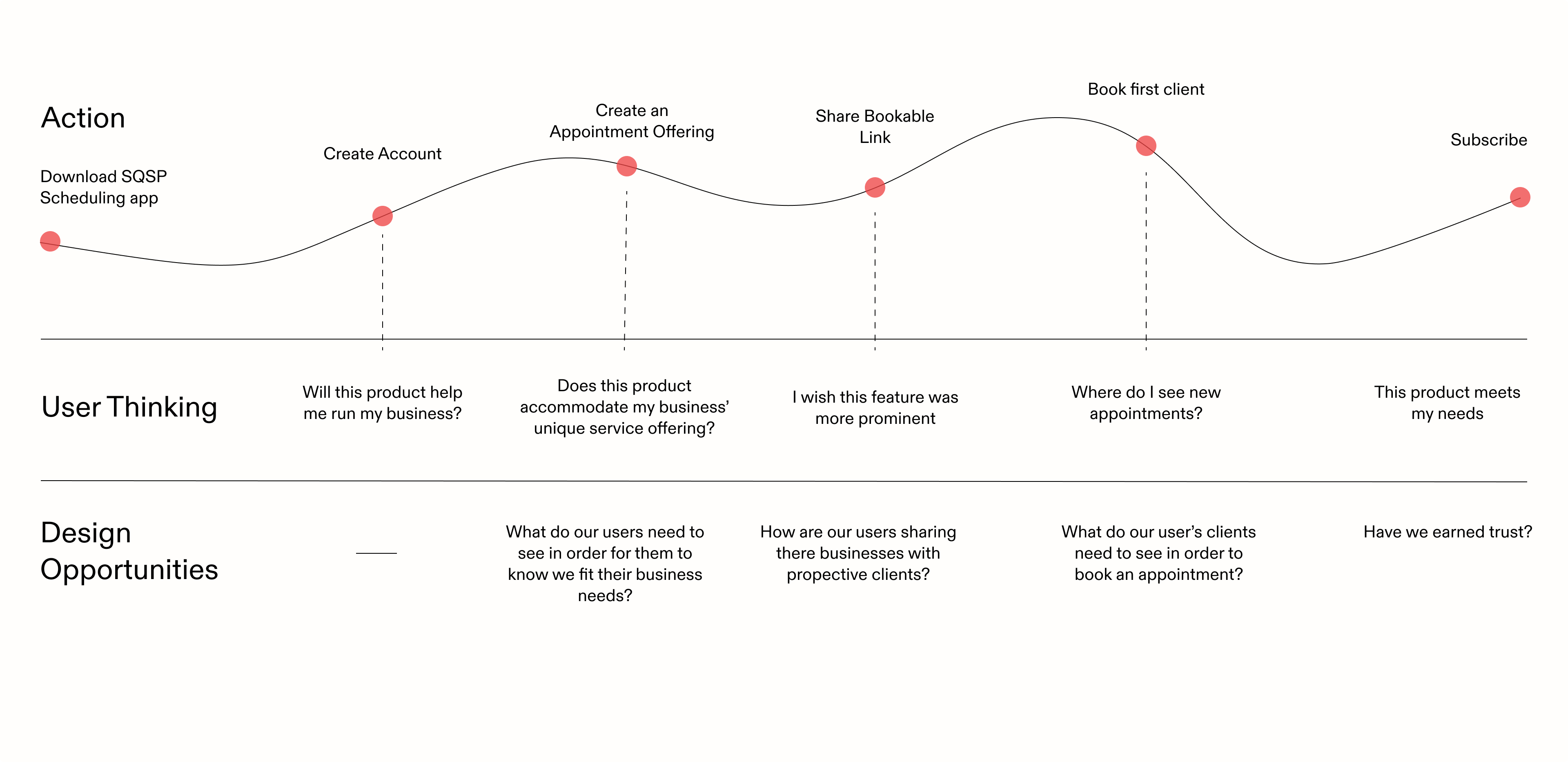
On desktop experience, users were more likely to subscribe having entered their availability and created at least one appointment type.
Action
Product Analytics told a very compelling story about our "successful" users. On desktop, Those who entered in their hours of availability into the platform boasted aa 60% Trial to Subscription rate. On the mobile experience, we were able to see that users who haad created an appointment or class offering within the first 10 days of downloading the app were 30% more likely to subscribe after their trial period was expired. This showed the importance of these two pieces of functionality within our users early journey on our mobile application.
I used the information along with the nuanced perspectives from the round of exporatory interviews to inform the initial design direction. The original direction leading these designs was the idea that users wouldn’t want to spend too long setting up their accounts before entering the actual app. Every screen was crafted with this in mind — only requiring users to enter the most important information as to not be too extensive or time-consuming. Once entering the app, users would be able to customize more information whether that be nuanced hours of operation or setting sliding scale payment options etc.
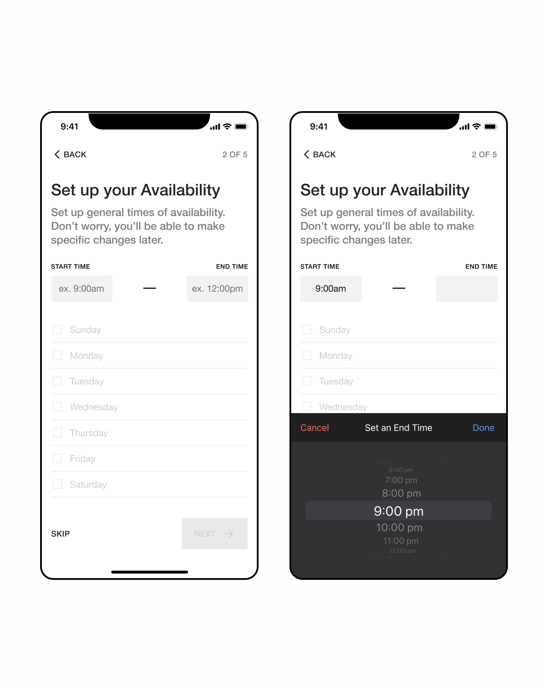
The first round usability testing taught our team the importance of flexible availability offerings our users want and need to feel comfortable investing in our platform. Many users mentioned wanting to add windows of availability instead of general hours of availability. Availability capabilities was actually the deciding factor for users in determining if a scheduling platform could actually satisfy their business needs.
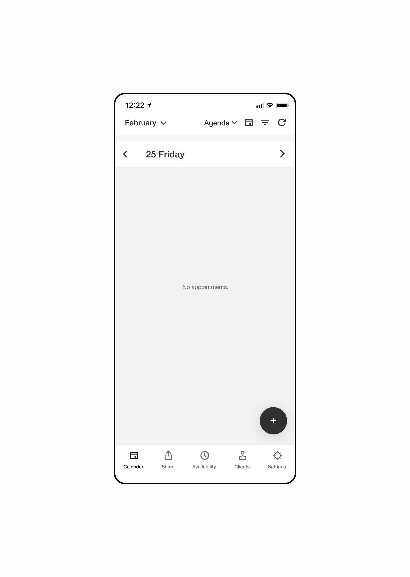
Even though this onboarding experience was geared towards educating users about out product offerings and helping them get oriented, many still felt as though they needed more to oritent them after completing the onboarding experience. When asked "Where woulld you go to edit this information?" many could not give a definitive answer. This alluded to the need of a post-onboarding experience that we wanted to test in this next phase.
Availability Concept Testing
After receiving this feedback, I created three availability concepts to test in an attempt to increase customizability of our users' schedules. I put these three concepts through some concept testing with users to see which they felt was more intuitive and would fit their business needs.
Users felt that option #1 (the first image, left to right) was the best of the bunch as it allowed them the flexibility to create the most nuanced schedules if they wanted.

takeaways
The team and I were able to finish this project by the end of the 7 weeks in order to equip are new users with the tools they need to leverage our platform. As a result, we saw Mobile Trial to Subscription rates increase by 10% allowing us to high our OKR objective.
[01]Users are increasing wanting products and features that allow them to have extreme customization power or flexibility to create things that are extentions of themselves. Though this is just a scheduling product - its best to always lean towards expressibility within the UI.
[02] Fail early and iterate!!